Kitchen Update – Before and After
June 29, 2015
It’s amazing how a kitchen can look totally new even when we don’t tear everything out and start over, and it’s such a smart move when your kitchen already has an efficient layout.
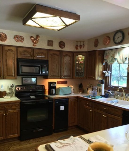
 Kitchen-Before, Photo Courtesy of Sweet Peas Design
It’s amazing how a kitchen can looktotally new even when we don’t tear everything out and start over, and it’ssuch a smart move when your kitchen already has an efficient layout. An updatecosts less, takes less time, makes less mess and produces less waste. Sounds like a win-win-win-win to us!
Forthis kitchen the clients asked us to brighten the space, reducethe clutter and give it a cleaner, simpler, more updated style. Painting the cabinets a soft white made a huge difference – no more 1980s oakgrain - and we replaced the existing cabinetknobs withoil-rubbed bronzeknobsand bin pulls fora tailored, crisp lookandto relate to the oil-rubbed bronze plumbing fixtures. Forthe soffit we removed the accessories and the wallpaper, addeddecorative crown and dental molding to match the crown throughout the house andpainted it the same color as the cabinets to make the cabinets appear taller. Kitchen-After, Photo Courtesy of Sweet Peas Design
Takea close look at the back splash too – we selected crackle-glazed ceramic subwaytiles in a pumice color and paired them with flirty, round marble tiles. Verytrendy but understated. The countertops are satin quartzite with a simple,squared-off edgedetail.
The apron sink is a newstyle from Kohler that creates a seamless edge between the sink and cabinet.
Noticethe comfortable new stools at the peninsula too – would you believe they arefrom Pottery Barn? The lighting is all new as well, including pendants and flushmount fixture in the center of the space and all are from Visual Comfort.
 Kitchen-After, Photo Courtesy of Sweet Peas Design
We gave the clients analmost completely new look while preserving as much as possible. Now theyhardly recognize their own kitchen!

Share
You Might Also Like
Find us on Instagram


