Around the Office: Magic in Mini Design
March 28, 2020
Patti takes a deeper look into mini design! She reflects on the nostalgia from youth, craftsmanship of the past, and the prevalence of the miniature today.
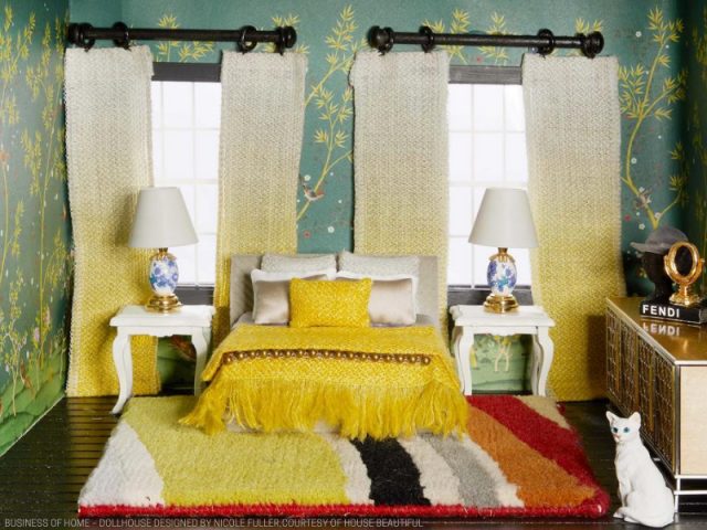
There is something so intriguing about tiny objects and small-scale design. When I came across an article on Business of Home with a photo of a miniature bedroom… featuring ombre drapery… I of course had to click (we recently installed gorgeous ombre drapery panels in a client’s dining room). The article explores miniature design, what allows it to capture our eye, and touches on the idea of nostalgia.
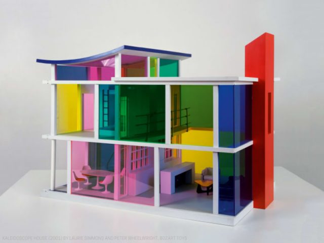
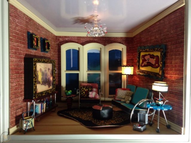
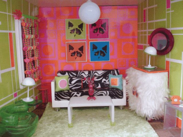
For me personally, the nostalgia is real. While I did not grow up with a traditional dollhouse per say, my sister and I (and my interior designer mother) loved designing and playing with small scale rooms. We were obsessed with American Girl’s AG Mini Rooms, which was released in October 2000 and discontinued in 2003. These were 12×12 boxes with magnetic walls for walls and windows and working electrical for tiny lamps and chandeliers. Limited Too era wallcovering, furniture, lighting, art and décor were sold in sets, but we had a knack for mixing and matching and spent hours decorating and re-decorating. When a room was complete, we’d photograph with a digital camera as if the room was normal scale. The Kaleidoscope House was another dollhouse we owned and absolutely loved. It was commissioned by Bozart Toys in 2001 and was a collaboration between artist Laurie Simmons and architect Peter Wheelwright. The dual stories, contemporary furniture and art, and sliding exterior colored walls are just so COOL. I have little memory decorating these rooms – more daydreaming about actually living in this house.
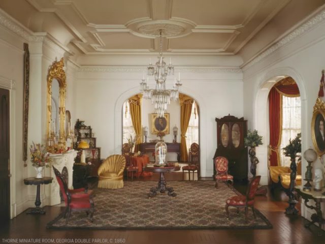
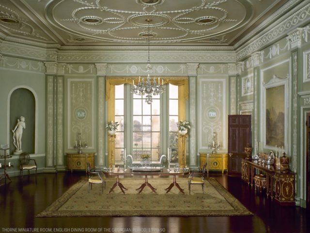
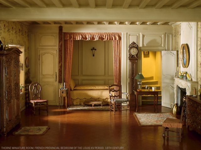
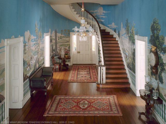
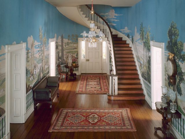
And of course, as an art enthusiast living in Chicago, after coming across the BOH article my mind was immediately drawn to the Thorne Miniature Rooms at the Art Institute. This permanent exhibit in the basement of the museum is one I return to every time I’m there. The display consists of 68 miniature models of rooms that portray European and American interiors ranging from the late 13th century to the 1940’s. The rooms were created by a number of extremely skilled craftsmen under the guidance of art patron Narcissa Thorne in Chicago the 1930’s. I think what’s most striking about these rooms is the precise attention to detail – across the board. The carvings on the wood furniture, the interior architecture, the textiles and wallpaper, the tiny individual crystals on the chandeliers. It’s important to note the material used – the wood, the crystals, the bronze, and even the commissioned artwork is all genuine. The rooms truly take you back in time, and even though they’re on a 1:12 scale, you can almost picture yourself standing inside. It’s hard to get bored in this exhibit, as there is always new details and décor to spot. It would have been fascinating to see the Thorne Rooms continue into the 60s, 70s and present day.
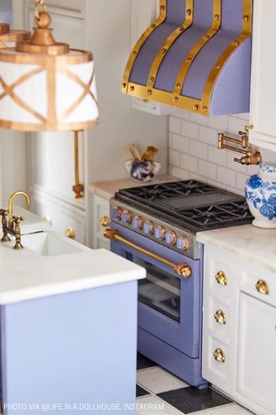
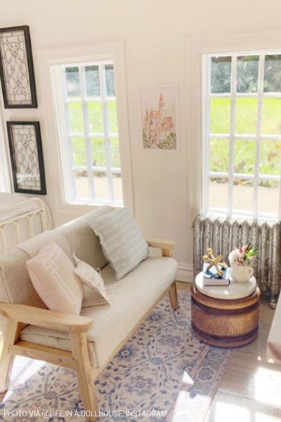
Which takes me back to the BOH article (that mini ombre drapery – article linked here) and its main focus on House Beautiful’s “Dollhouse Beautiful” project. 11 top designers were all given the same budget and blank canvas of a dollhouse to design and to be auctioned for the Kips Bay Boys & Girls Club, and a few of the designers utilized the same craftsperson… a 13-year-old girl, who builds the most amazing modern-day mini things. Like the furnishings and décor of the Thorne Rooms, the design details of those made by Life in A Dollhouse transport you – but into a room that’s a little bit more attainable. I still can’t quite put my finger on what’s so fascinating about tiny design, but there is clearly something magical about the miniature!

Share
You Might Also Like
Find us on Instagram
